3 — Typography
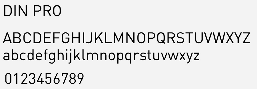
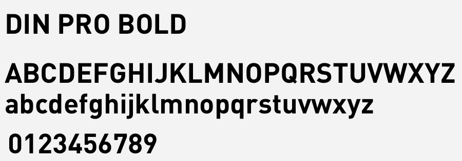
DIN is a realist sans-serif typeface. It was designed in 1995 by Albert-Jan Pool, based on DIN-Mittelschrift and DIN-Engschrift, as defined in the German standard DIN 1451. DIN is an acronym for Deutsches Institut für Normung (German Institute of Standardisation). It was published by FontShop in its FontFont library of typefaces. FF DIN has an unadorned appearance with high x-height and a large series of weights. It became very popular: as of September 2017, it remained the best-selling typeface on the MyFonts font sales website.
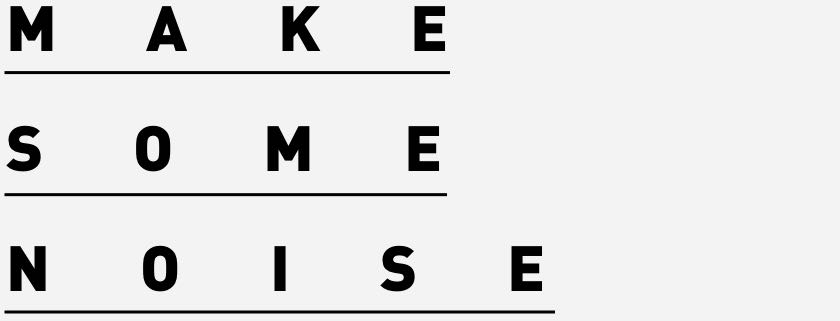
Headlines
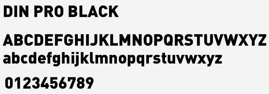
Din Pro Black
60pt / 90pt ( 2:3 )
Letter-spacing: 48 (5:4)





Subheadlines
Din Pro Black
24pt
Din Pro
12pt
Letter-spacing: 0


